Trading Standards Would Like a Word: Inventing a British Brand That Never Existed
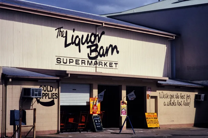
There is a particular joy in a fake brand. A crisp packet labelled ‘Crisp & Proper’. A hardware shop called ‘Bodgeit & Sons’. A supermarket fascia reading ‘Ffine Fare’ in a typeface that suggests it has been trading since 1974 and has strong opinions about queueing. Audiences read these things in a heartbeat. They know the world before the sketch has even explained it.
The trouble starts when a fake brand becomes a bit too knowing. British chains have legal teams, and those legal teams have stationery. The aim is not to make something that survives a courtroom; it is to make something that never needs to go near one. A fictional company should feel instantly British, instantly legible and entirely your own.
Start With the Shelf, Not the Logo
Most British brand shorthand lives in the props, not the logo. A shopfront with a slightly tired awning. A carrier bag with a font that looks like it was chosen by a committee in 1988. A product label promising ‘traditional recipe’ and ‘no nonsense’ in the same breath. These are visual cues, not trademarks.
Build your fake company from the shelf outwards. What does it sell? Who is it for? Is it a family firm, a regional chain, a wellness brand with a suspiciously serene typeface, or a discount supermarket that seems to have been assembled from whatever was left in the signage warehouse? Once you know that, the design follows.
Useful British signifiers include:
- A name with ‘& Sons’, ‘Ltd’, ‘Co.’ or a regional suffix, used sparingly.
- A crest-like shape without pretending to be a royal warrant.
- Muted green, burgundy, cream or navy, unless you are deliberately doing budget neon.
- A slogan that sounds like it was approved by a committee: ‘Properly done’, ‘Since 1974’, ‘For the everyday’.
- Packaging with a lot of white space and one slightly apologetic line of small print.
The danger is not using a British style. The danger is using another company’s specific combination of name, colour, typography, mascot and trade dress. Changing one letter of a real brand is not a clever loophole; it is a headache with a logo. ‘Tesco’ to ‘Tesko’ is the kind of gag that makes a legal department reach for a fresh pad of paper.
The Legal Bit, Briefly and Without a Wig
This is not legal advice, and no article about fake crisps should be. But the practical principle is simple: make the brand distinct enough that no reasonable viewer would think it is a real company, and no real company would think you are trading off its identity.
In the UK, trademark and passing-off concerns can arise if a fictional brand is confusingly similar to a real one, especially if it appears in commercial content. Parody is not a magic shield. A sketch can be funny and still cause a problem if it borrows a real logo, mascot or distinctive packaging too closely. Avoid real brand names, real slogans, real mascots and real product shapes that are strongly associated with one company.
Do a quick search before you commit. Check the name on Companies House and the UK IPO trademark database. It takes minutes and saves the sort of email that begins ‘We act on behalf of…’. If your fake brand appears in paid work, client work or anything with a whiff of advertising, be extra careful. A fictional company in a sketch is one thing; a fictional company that looks like an advert for a real one is quite another.
Prop Rules for a Brand You Can Reuse
The best fake brands are not one-off gags. They are production design with a punchline. Build a small brand bible: logo files, colour codes, a typeface you can actually licence, packaging templates, a stamp, stickers and a couple of signage boards. Print more than you need. Continuity is cheaper than reshoots.
On set, make the brand easy to control. Put real snacks and drinks out of shot or cover them with plain labels. Check monitors for stray logos on laptops, water bottles, hoodies and coffee cups. Keep a roll of custom stickers and a sheet of blank labels in the kit. If a real carrier bag wanders into frame, it will be the only thing the audience remembers.
Give the brand a few consistent physical forms: a paper bag, a mug, a van decal, a shelf talker, a staff badge. These are the props that let a sketch return to the same fictional world without rebuilding it. A fake brand should look like it has a history, even if that history was designed on a Tuesday.
The Cheapest Running Gag in the Building
A well-built fake company can become a sketch’s cheapest running gag because it costs almost nothing to reuse. The same bakery carrier bag turns up in three different sketches. The same hardware shop sign appears in a background. The same product label becomes a callback. Audiences love spotting a fictional universe almost as much as they love spotting a real one.
Give your brand one absurd detail and let it travel. A slogan that makes no sense. A founder’s name that is slightly wrong. A product line that raises questions: ‘Marrow’s Tinned Peas: A Family Favourite Since Last Thursday’. The detail does the comedy; the design does the credibility.
In 2026, with sketches moving fast and short-form work demanding instant recognition, a reusable fake brand is not just a prop. It is a tiny piece of world-building. Keep it British, keep it distinct, and keep the receipt. If the name feels a bit too close to something real, it probably is. Trading Standards would rather you invented a worse company with a better lawyer-proof logo.